New Canada West logo will make more appearances at U of C in 2018
By Christie Melhorn, January 16 2018 —
Scores, statistics and sports technology are generally dominant topics of discussion regarding the sports world. The significance of insignias and logos representing teams and leagues is easily overlooked since interact with them on such a frequent basis. However, thorough consideration goes into their design to ensure an organization’s identity is accurately and concisely reflected. In 2018, the Dinos Athletic Department will be installing the refreshed Canada West (CW) logo more rigorously into Dinos branding.
In August 2017, Canada West launched a simplified logo. In red and white, the words “Canada West” are stacked inside of a shield shape crowned by the top of a segmented maple leaf.
Assistant director of Dinos communications and operations Ben Matchett says the new logo is a significant improvement from the CW’s previous branding. The previous logo featured blue silhouettes of four Western Canadian provinces bordered by a circle with the words “Canada West: Universities Athletic Association” underneath. He says that the prevalence of social media platforms demands organizations to use minimalistic and aesthetically pleasing visual identities.
“The old brand was getting pretty tired and was quite literal. A lot of these visual identities were created at a time when their use was less frequent,” Matchett said. “Social media has created a digital realm that everything has to exist in now. There’s a significant trend in the simplification of a visual identity due to the string of ways it can now be used.”

Photo courtesy Canada West
While the logo may be new, Matchett explains its design borrows elements from previous logos, echoing the conference’s entrenched legacy of supporting Canadian post-secondary athletics.
“There are many components that wouldn’t be obvious to the casual observer,” Matchett said. “The shape of the maple leaf was taken from the stylized leaf on CW’s original logo. The stacking element used for the wording was also borrowed from another previous logo. It strongly draws from history.”
He says that the new look’s versatility makes it more accessible for the Dinos to utilize.
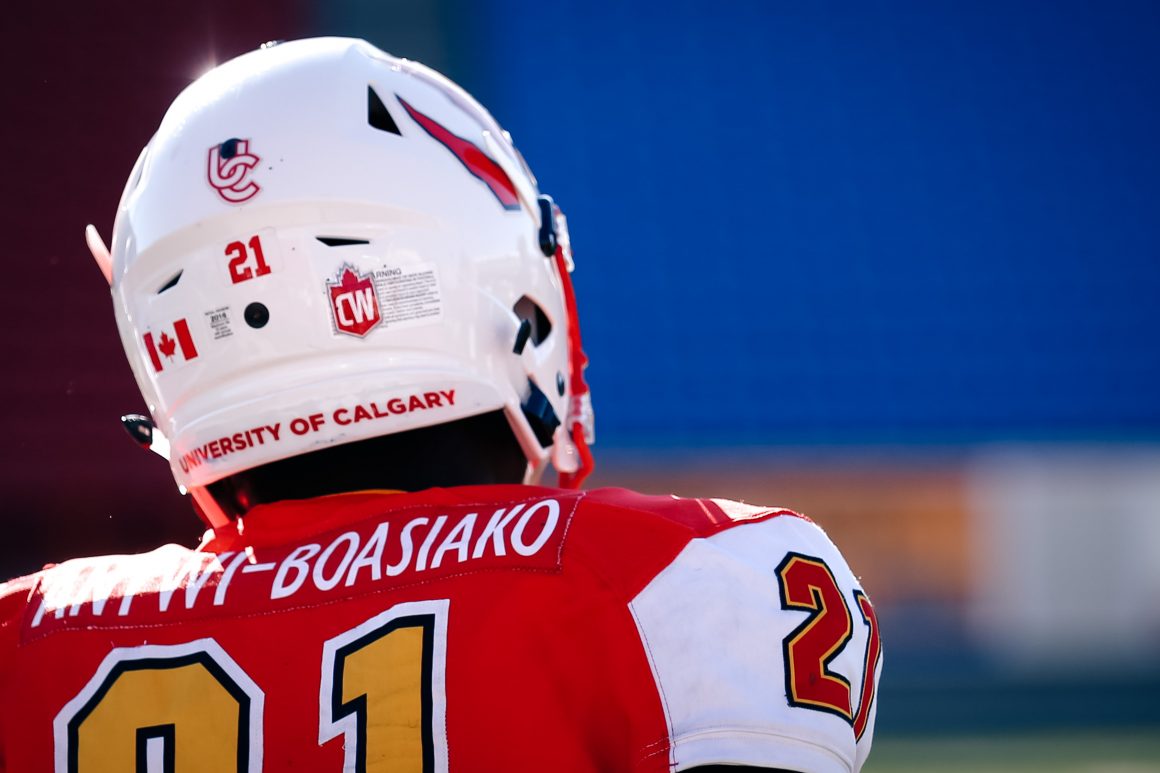
“The old logo is blue and so [the Dinos] hesitated to use it. The CW chose to make a colour way for each of the 17 schools so it can be used in ways that benefits and matches each institutions identity,” Matchett said. “Over the next two or three years you’ll see it more. It’s already on football and hockey helmets but will appear on every Dinos uniform going forward and in far more places than before.”
Matchett also says that the rebranding adds aesthetic consistency across different aspects of the conference.
“The Canada West championships have been rebranded by making the banners and metals the same shape as the new logo,” Matchett said. “The symbol is the central piece of the rebranding but it is part of a much larger visual identity. The Dinos will be using it more to reinforce the brand and organization we’re proud to be a part of.”