
What makes the University of Calgary so ugly?
By Gloria Elekwa, March 1, 2016 —
Many University of Calgary buildings were constructed over 50 years ago, and it’s starting to show. Stepping onto the U of C campus for the first time can be intimidating — the buildings are tall and imposing, many of hallways look identical and navigating both indoors and outdoors can feel like running through a maze.
If an overly complex layout was the intention of the U of C’s original architects, then I suppose they were successful. Otherwise, it’s hard to find anything else uniting the architecture of the school’s various buildings.
Alberta’s Department of Public Works built many of the campus’s older buildings in the late ‘60s, working under a principle of controlled variety. They wanted to create small, intimate spaces while covering most of the exteriors with textured concrete and flamingo quartzite. While students looking for a private study space in one of the older buildings might appreciate this mentality, a visiting professor lost in our winding, beige halls may wonder if a more traditional direction would have been wiser.
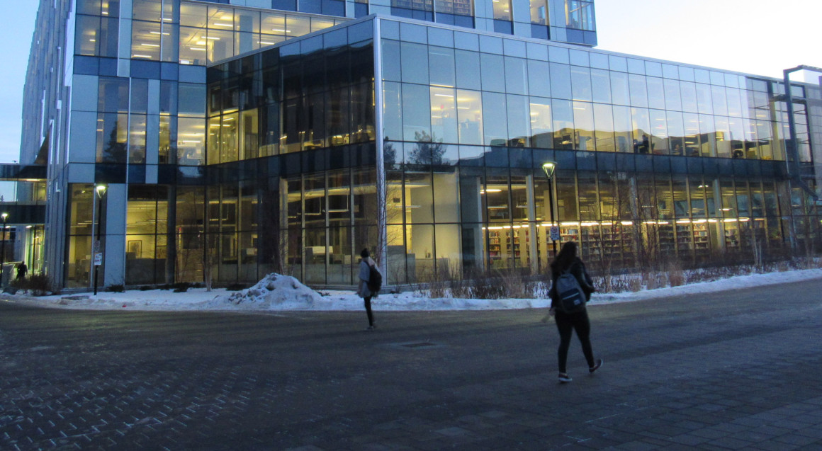
In contrast, the newer buildings take a completely different approach to interior and exterior design. The EEEL building, for example, boasts an open, glass-covered space with a uniform, boxy exterior — completely unlike the closed, winding halls of Math Sciences or the Education Block. These glossy new structures look awkward amongst the older buildings, with walls going from glass to concrete to glass again.
Despite this lack of cohesion in the buildings’ exteriors, the interiors often have the opposite problem. The glass covered walkway leading to the Biological Science complex is almost identical to the walkway leading to the Professional Faculties Building, and most students would be hard pressed to tell the cramped office floors of Social Sciences or Earth Sciences apart by layout alone.
This isn’t helped by a lack of windows and an overabundance of twisting hallways — even if you’re a student here, it’s possible to walk around in circles until nothing is recognizable anymore.
Of course, there is still a chance the U of C could learn from it’s architectural mistakes. As the university expands, it is important that developers and planners understand the need for organization and navigational ease alongside aesthetic concerns. A building could look absolutely beautiful, but it would still be badly designed if a student couldn’t find their way around it.
This focus on organization also works when applied to campus as a whole. With any luck, the U of C could stop looking like a collection of random buildings, and start looking like a unified campus. We don’t want the next generation of students to conclude that we were a bunch of haphazard intellectuals with no sense of direction.